Bowowser (Amazon)
Overview
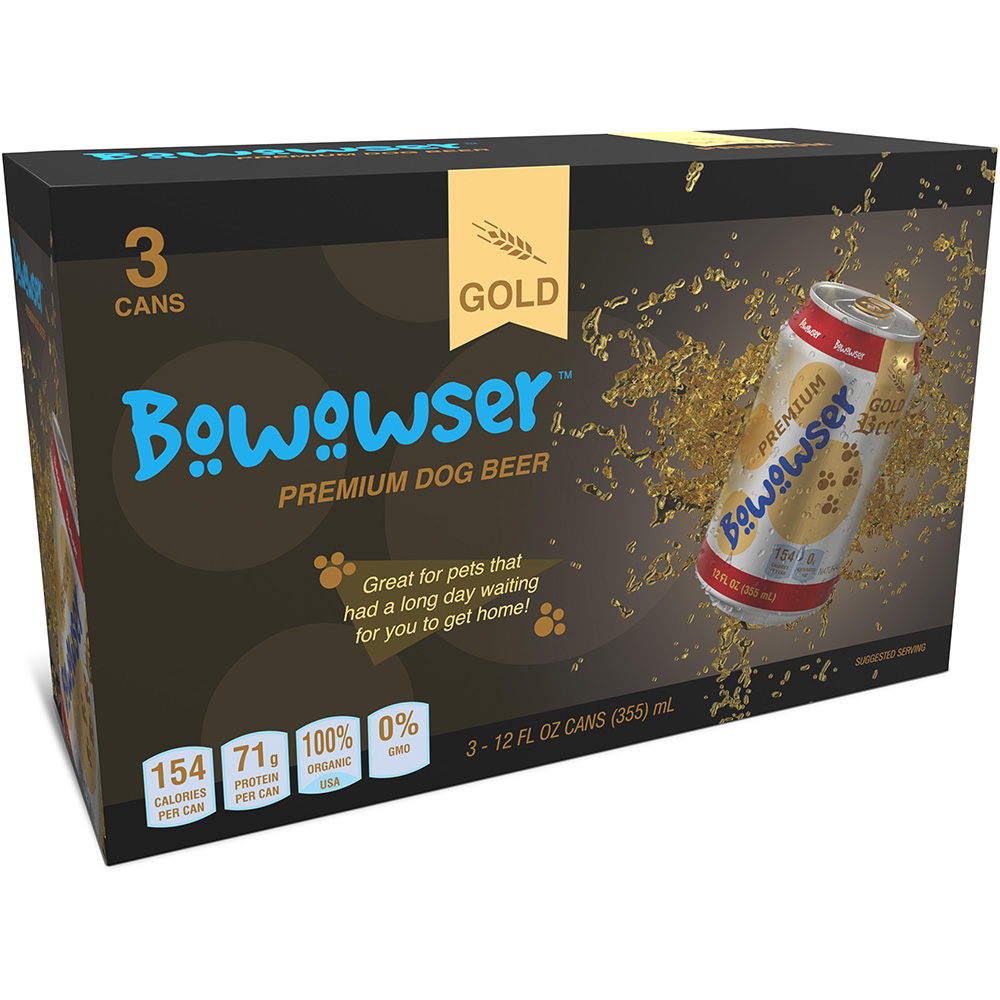
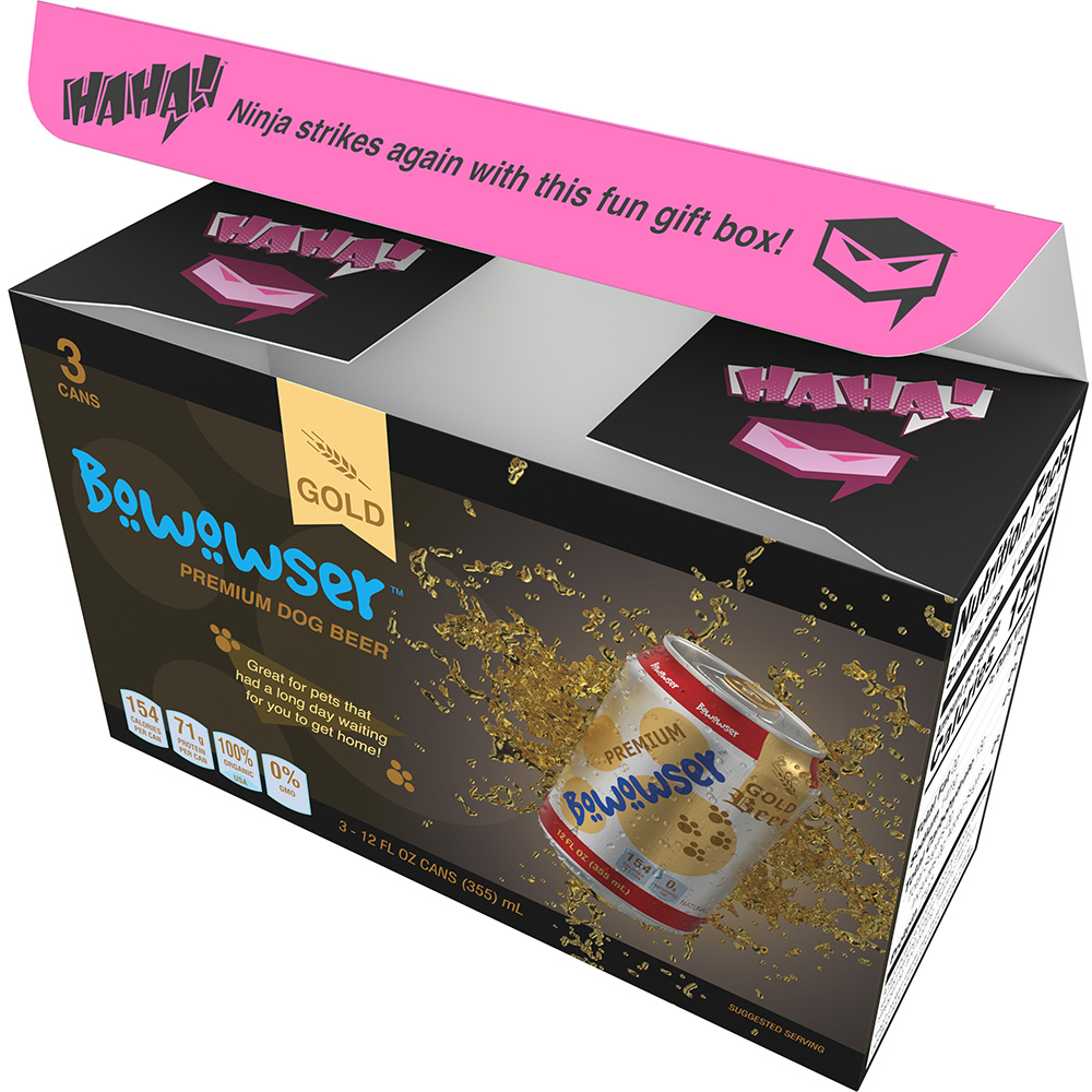
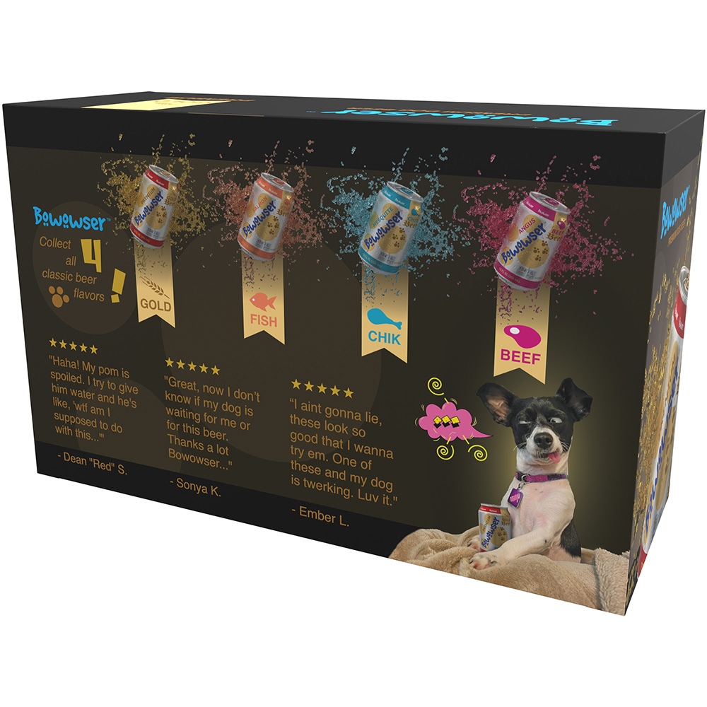
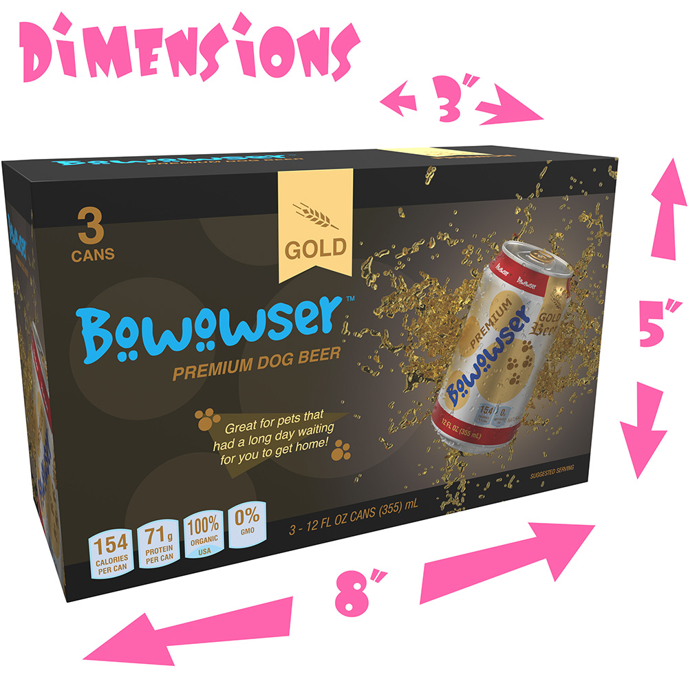
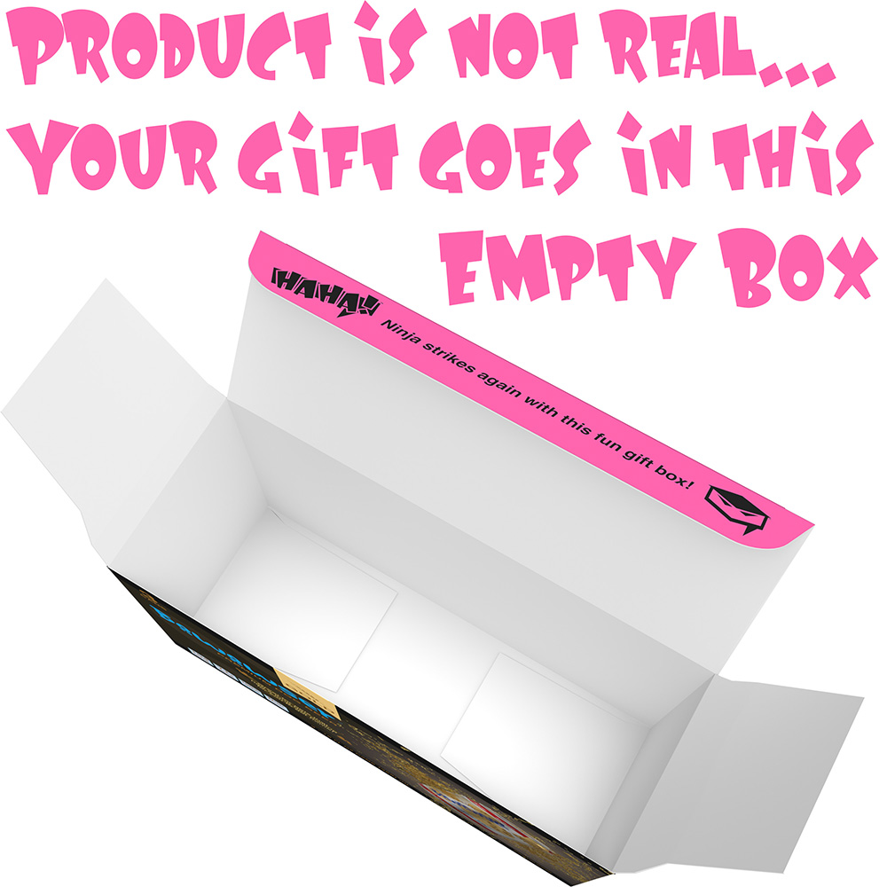
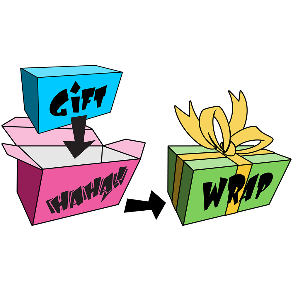
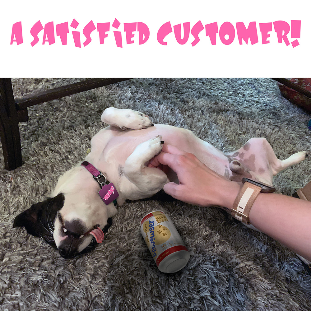
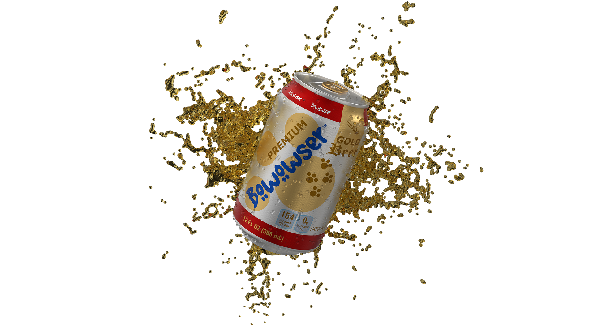
This is for Amazon imagery. Amazon uses square images (1:1 ratio) with a white background. Amazon style guide says you must a clear and clean background for images (white); this includes the main image. For Etsy, the advantage is more creative freedom in the images (example would be the feature image I used with bokeh background).
Since Amazon uses a white background and the product has a white background, we can maximize the imagery to the edges without compromising quality and padding. A larger product image is recommend for a greater customer experience. For Etsy, the disadvantage when being artsy with images is the product is smaller because you are adding it to a scene but it looks nicer.
View on Amazon.
Role
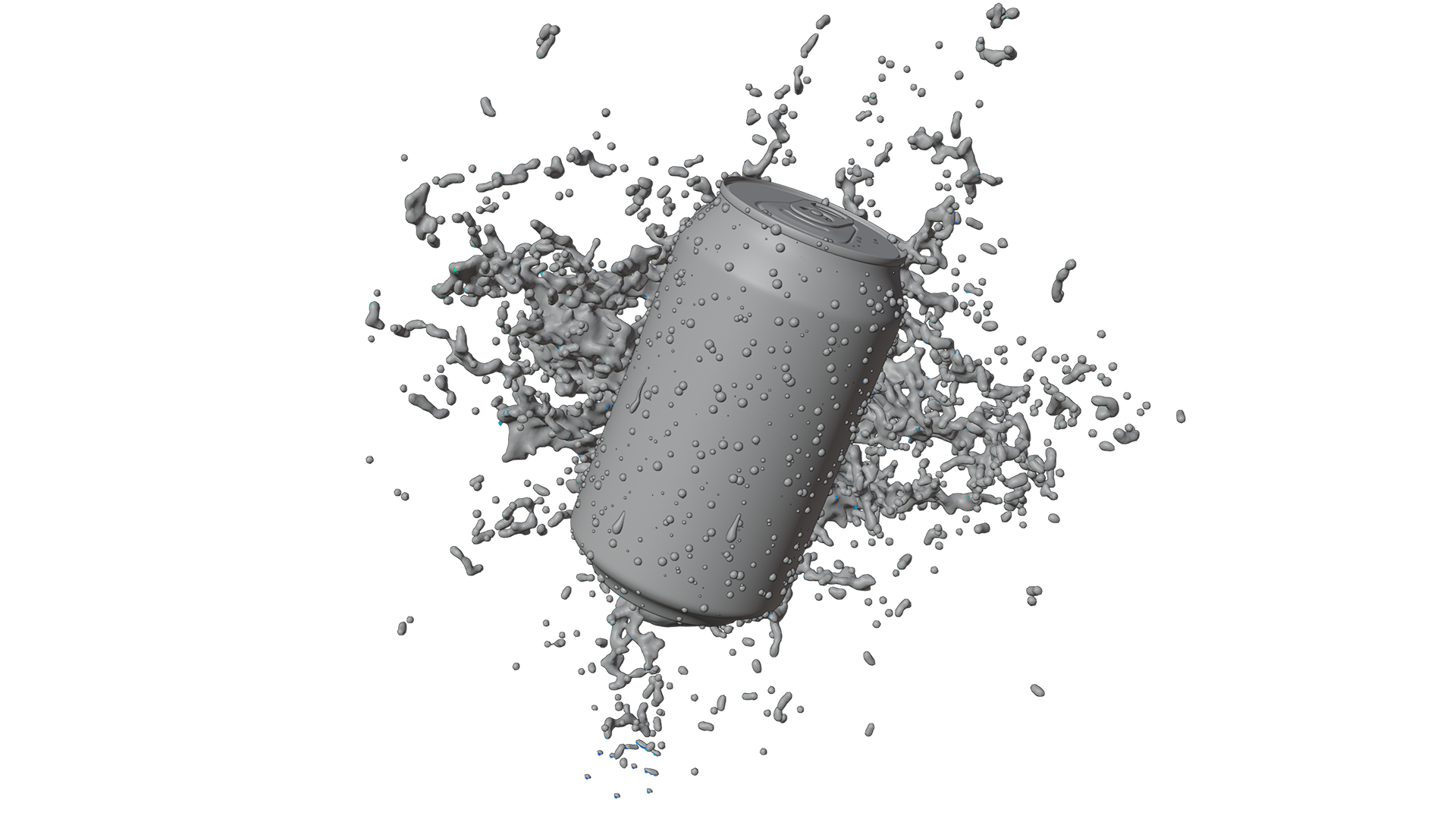
From concept to completion. I led and performed the design, photography, art, 3D, messaging, quality checks, and edits.
