Infoboard

Overview
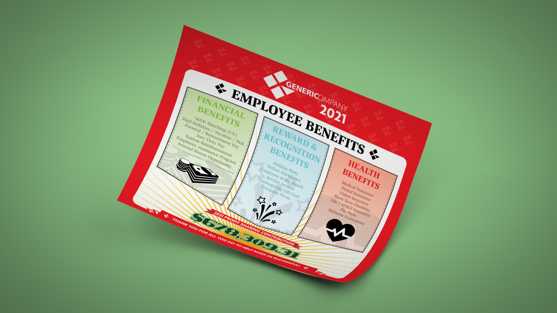
This is for a company to show its yearly benefits. The ratio between visuals and copy had to be 50:50 since the information was important. We removed any wordy fluff to keep it simple and to the point.
Role
I led and performed the design and edits.