Signature Brands

Overview
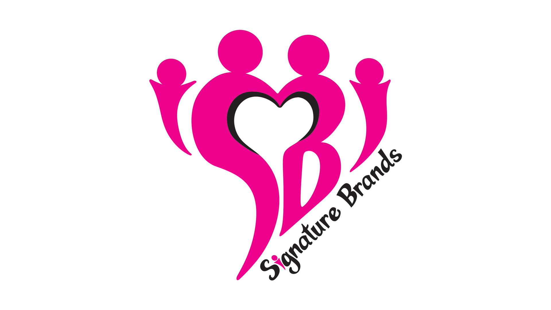
SB wanted a fresh, modern, forward-thinking logo update that conveyed a family vibe with a perfectly imperfect aesthetic. We shaped the initials to form a mom and dad holding hands thus shaping a heart in the negative space. We opted for the company name to be diagonal to enhance “fun” and be forward-thinking since this is normally horizontal.
Being perfectly imperfect stems from promoting the brands as being amateur friendly so it is ok to make mistakes, look sloppy, and have fun. At first, we had the edges straight, rounded, and crisp but the CEO opted to keep it imperfect.
Role
This was a group effort. We followed the CEO’s feedback and instructions to create his vision. Each creative participated to create this modern logo.