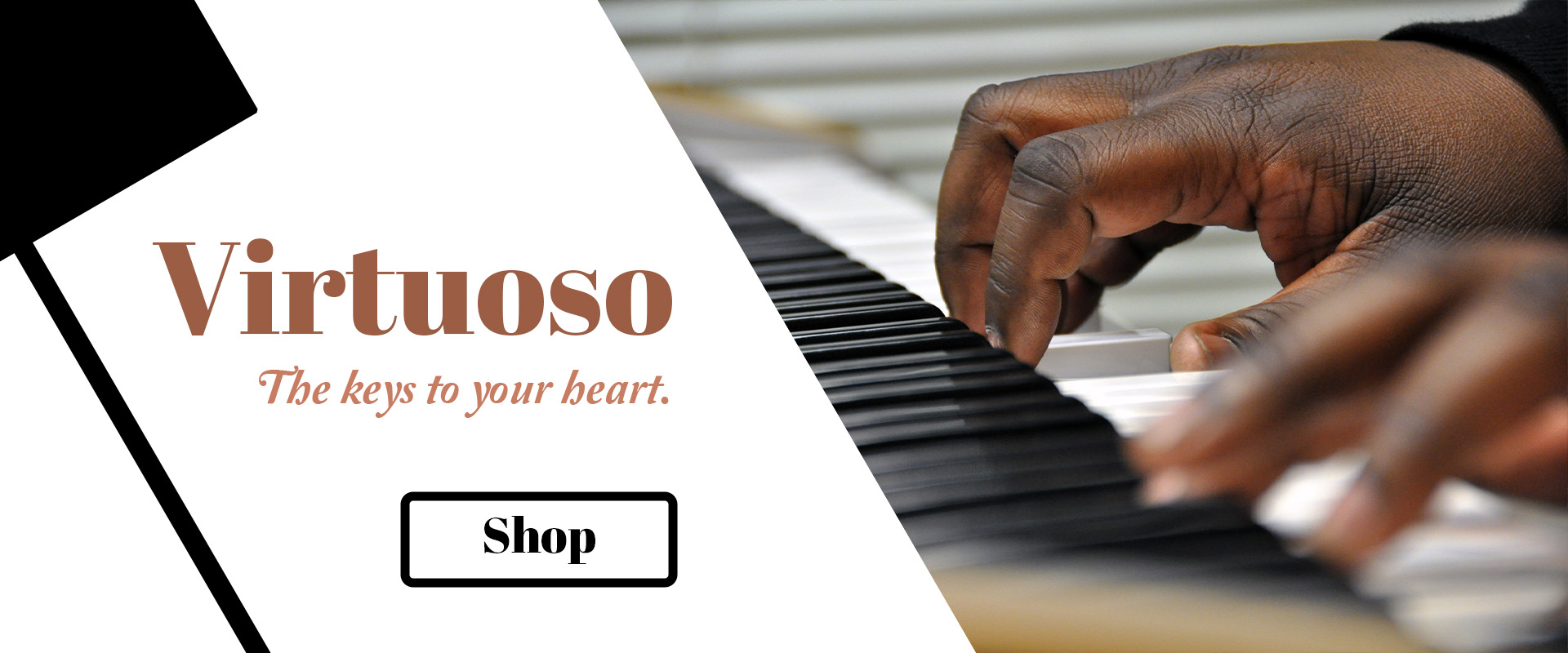
Virtuoso Banner

Overview
I wanted to modernize what is normally a classic appearance. By using a slanted graphic that is a close up shot of piano keys, this allows space for messaging and puts a classic form in the modern era. Elegance still remains with clean lines and shapes. To expand on this, diversity allows the visuals to be on an inclusive and forward-thinking level. The “hand model” really knows how to play the piano and plays beautifully. I captured this shot while he was playing the piano so the hand and finger positions would be accurate.
The photo was constructed so the scene had a nice flow. This includes the lines in the background. I repositioned the piano so the vector was going the same direction. It was all about shot composition.
I provided a tagline that is a solid winner. I love being creative with taglines since it really sells the essence of a company.
Role
From concept to completion. I led and performed the design, photography, art, messaging, quality checks, and edits.